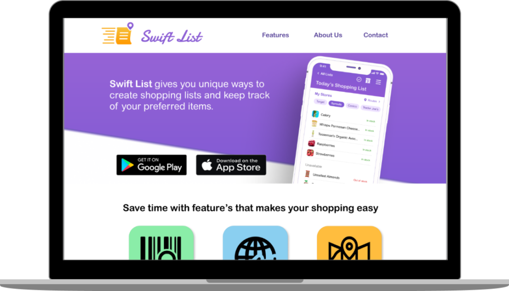
The original objective of our project was to create a grocery shopping app. The app we designed is called Swift List. There are many apps focusing on food and shopping, and we wanted to become familiar with these types of interfaces while also designing a feature that sets our app apart from the others.
Statement:How might we design a shopping list app that allows the main shopper forthe household keep track of theirpreferred items and which stores they should go to.
Solution: Design an app that has features to keep track of your preferred items
Role: UX designer, UX researcher, UI Designer
Tools used: Figma, Miro, Invision, Adobe Illustrator, HTML, C
Unique ways to create shopping lists and keep track of your preferred items
Research
During the empathy phase of our design process, we interviewed a pool of 5 people about their grocery shopping habits and found that users have a hard time keeping track of which stores carry their specific, preferred items. One person said that she has notes where she writes down the stores that carry her preferred items, but it’s not super organized.
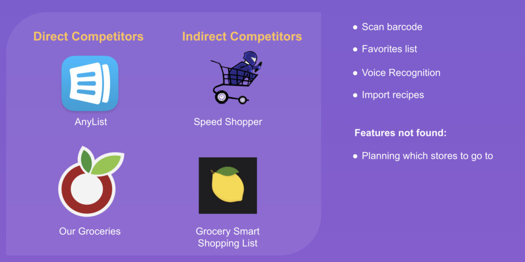
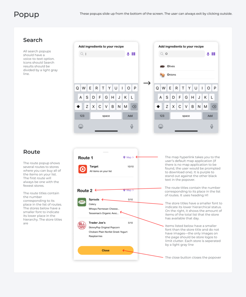
We thought, what if our app had a way to show you routes to the stores that carry the items on your grocery list, essentially planning your trip for the user, assuring that the stores they are going to will have the items they seek.
Definition
We thought, what if our app had a way to show you routes to the stores that carry the items on your grocery list, essentially planning your trip for the user, assuring that the stores they are going to will have the items they seek. After seeing the features of our competitors, we found that planning which stores to go to was not included in any other apps and we decided to make it one of the main features of our app.
Ideation
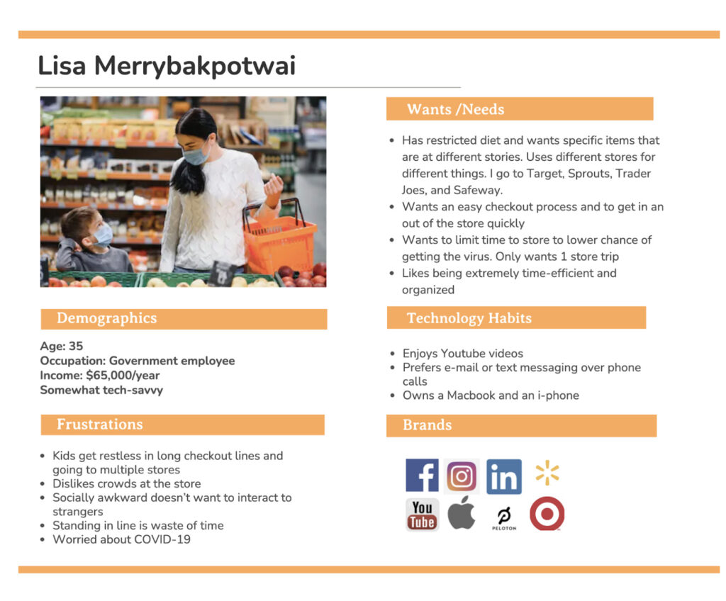
As an exercise, we configured a user persona who is the main shopper and meal planner of her household and cooked up a scenario and journey map that we could reference as we designed the app.
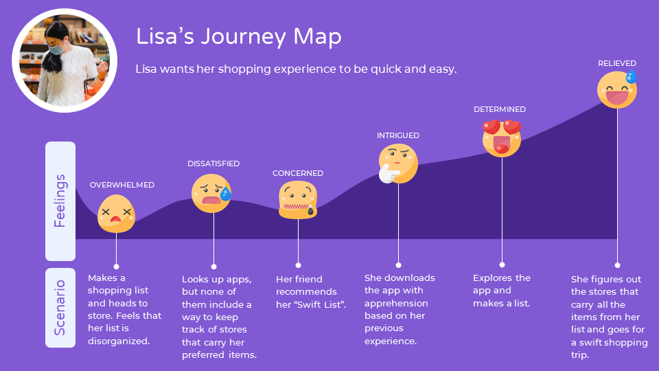
Moving on to the User Journey Map, our User Lisa wants her shopping experience to be quick and easy. Lisa tries to make a shopping list and goes shopping but isn’t happy with her experience. She looks up on different apps but cannot find a relevant one. Being sad, she describes her situation to a friend and she recommends her to use Swift List. She is eventually happy using the app where she finds the store and its route through the app.
Prototyping
We began our ideation phase by separately drawing our own vision of what our app might look like and then we got together to discuss the whole idea.
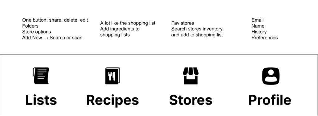
So, We combined a rough information map of our navigation and then moved to wireframing.
Testing
After usability testing with 6 people, we recognized several issues with our initial design. One of them being that the edit icon was confusing alongside the plus icon. Also, users preferred to check off items as they shopped but they did not want to delete them. So some of these features weren’t included in our first draft. We also had to rethink where to place our My store navigation feature. When asked to add a store and shop for an item within that store, our users kept going to the “Lists” tab. They didn’t want to go to an entirely different tab in the navigation to shop within a store.
Style Guide
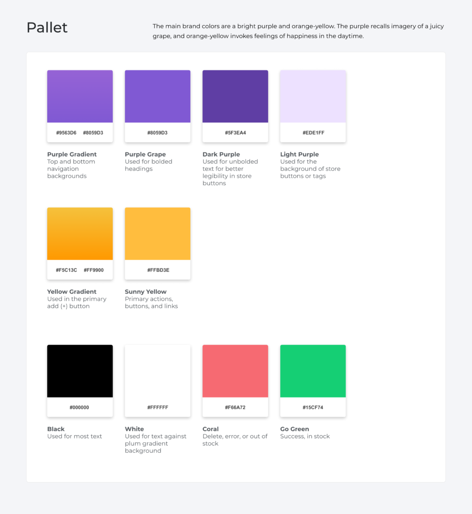
We also want to make an onboarding process that includes tooltips and explore some other changes. Moving on, We also began to put together our style guide. We got a comment during our user testing that we could use more “soft” icons rather than rigid. So we decided to change that and also apply the idea to our font choice. We went with Arial Rounded, which is a highly readable font and is also soft and friendly. For our color pallet, we chose a bright purple as our main brand color that reminds us of something tasty like a juicy grape. Our accent color is a sunny yellow that sits opposite of the color wheel and is also bright and happy.
Conclusion
We learned many things during this project. Now we have a deeper understanding of grocery shopping apps and other types of list apps, which are plentiful and useful to know as designers. We realized that we could have tested the navigation a bit earlier, which would have saved some time during iterations. We also learned that edit icons especially have a wide range of meaning and could be confused with many other actions. In the future, we want to do more user testing to see if our final prototype needs additional changes, or if other features would be useful- like statistics about the user’s spending and dietary habits, or price comparisons.