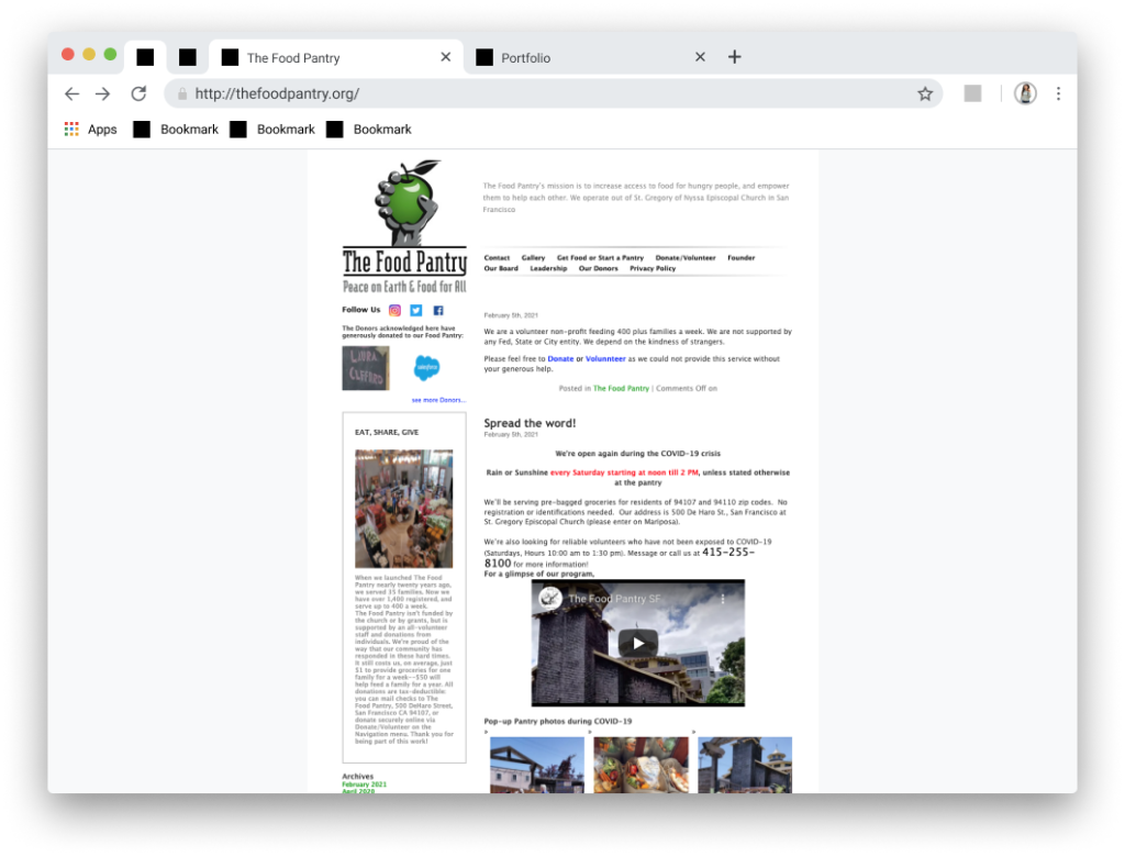
At its core The Pantry’s mission is to feed community members in need. The site was primarily being used by donors to give to the group and on occasion by people in need to find the donation location.
Statement: The Food Pantry’s main mission is to feed hungry people and empower them to help each other. We learned that The Food Pantry has been having a hard time finding volunteers, attracting donors and informing families in need.
Solution: Improve the quality of the website by improving functionality and enhancing the visuals to serve the community.
When interviewing Food Pantry’s shareholder Michael we identified his feelings on the website, with him stating ”it’s not the greatest and that the group needs $20,000 a year at minimum to handle operations”. The site as currently constructed is more of a blog. Michael also stated that the website was used mostly to take donations and that the group had been having trouble attracting volunteers during covid. We continued our research by analyzing the current website. We conducted a survey and 5 second tests. While our participation wasn’t as strong as we hoped we did gain some valuable insight. Most people were willing to volunteer and donate but didn’t know where to turn. Survey responders found out about charities from multiple sources but must agree with the groups mission and trust the charity. The website plays a large part in building that trust.
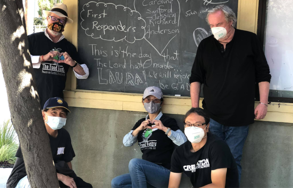
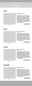
The Food Pantry’s team: Michael is the first one from the right side
– We actually have the website to give you basic information. Although, we’ve been using social media a lot better for most of our needs. The website gives us a place to take donations.
– Our website not the greatest, given the subject matter. It’s not dynamic or anything. You know, you’ve got to kind of keep it plain and reasonable for easy access.
– Well, we’re a nonprofit, of course, we’re not receiving any government funding… We’re completely supported by donations. We do fundraising drives obviously. You know it takes about $20,000 a year to do what we do minimum.
Definition
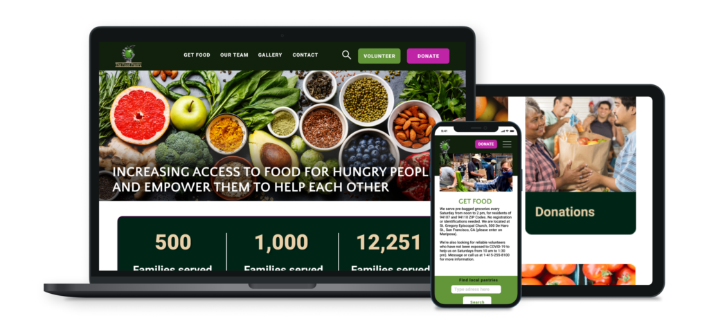
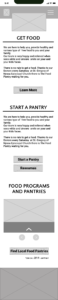
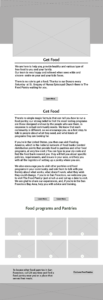
The current Food Pantry page is constructed more like a blog than a contemporary webpage. When tested users complained about multiple issues that include, but are not limited to:
No clear donate button
The menu bar being too small
The mission statement not being visible
Navigation issues
Information pop-up screen on every page that is infuriating
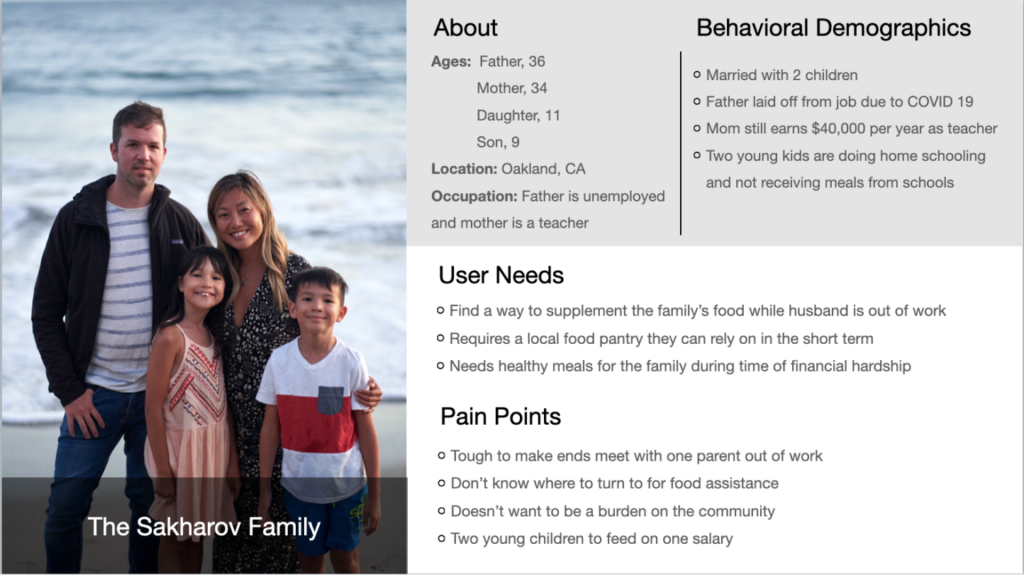
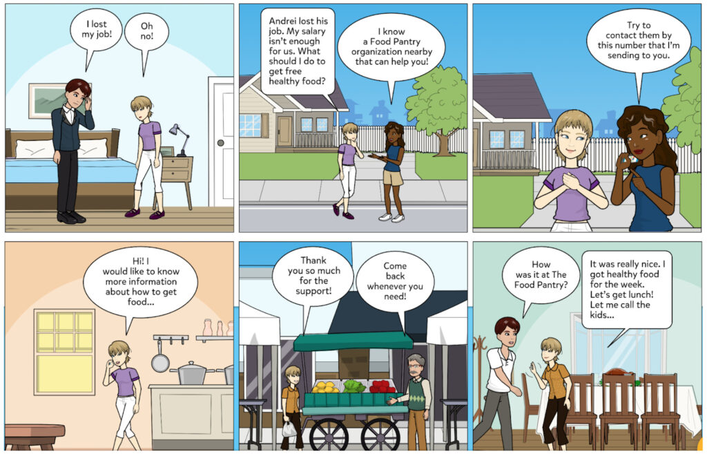
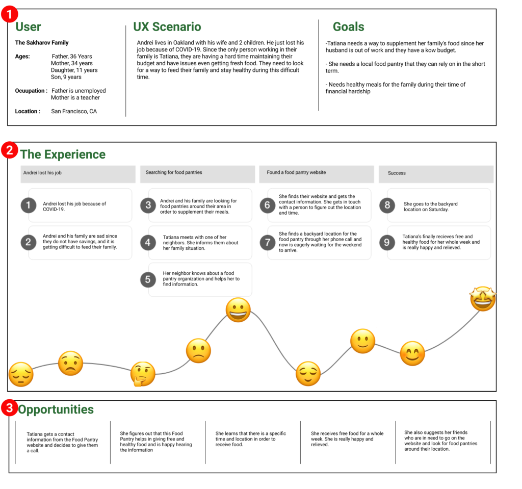
After learning more about our charity and our users we created a user persona for the Sakharov family: Andrei, Tatiana and two young children.
Ideation
After learning more about our charity and our users we created a user persona for the Sakharov family. Andrei, Tatiana and two young children. We created a User Journey to empathize with the user and find out how they would feel during every step of the process. While Tatiana and Andrei started out sad and concerned, things began to look up when they visited the Food Pantry Website. Their user experience brought them joy and hope.
After learning more about our charity and our users we created a user persona for the Sakharov family:
Andrei, Tatiana and two young children.
We imagined their story and what circumstances led them to finding the Food Pantry.
Andrei recently lost his job and Tatiana is now the only breadwinner for her family.
A friend tells her about the Food Pantry website
She calls and finds a location for the donation site.
Tatiana is able to get food for the week to supplement their groceries.
We created a User Journey to empathize with the user and find out how they would feel during every step of the process. While Tatiana and Andrei started out sad and concerned, things began to look up when they visited the Food Pantry Website. Their user experience brought them joy and hope.
Prototyping
We laid out our sections and sketched our pages digitally with some low fidelity prototypes. All of our group members had a hand in designing the homepage with each individual member being responsible for other pages. We all came together everyday to unify the design. In order to make a responsive product for The Food Pantry we also created a mobile version of the website with roughly the same collaborative process. Coming together to make key design decisions on the mobile homepage followed by building individual pages.
Previous
Next
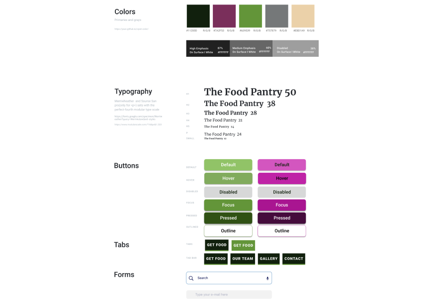
Style Guide
We began the process of designing hi fidelity pages by creating a style guide for usage that the group could follow. We labored over every small detail from color to brand logo for days before placing the final elements! We decided in the end that we would hold true to the colors presented in the users logo. We enhanced the green apple of the logo with a complementary purple found in onions for buttons and hi lights. A tertiary light tan reflected the hundreds of paper bags of food given to the community
Style guide
Testing
When testing our redesigned website the feedback was generally positive with users saying it was easy to navigate and the dedicated buttons were easier to find. Some negative feedback was given like missing buttons which were fixed during the next iterations.
“Navigation is pretty fluent and easy to navigate”
“I like the layout. It’s pretty simple and straightforward”
“Call-to-action buttons are obvious and will be beneficial for the website”
Conclusion
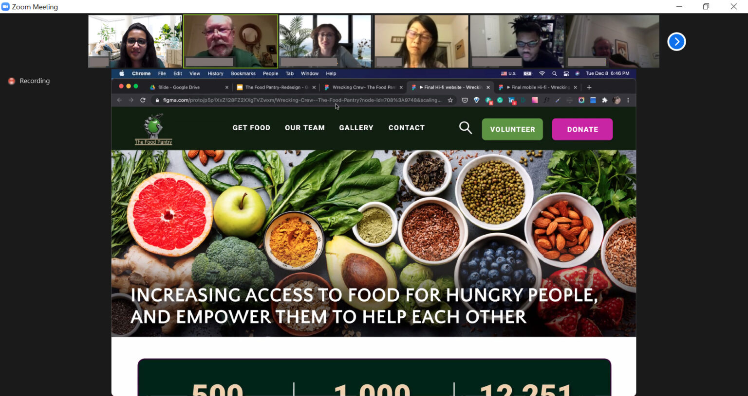
During our interview with shareholders we found out a lot of the community members who The Food Pantry serves are Russian and Spanish speakers and we would like to implement those translated languages. We had a chance to show the redesign website to the shareholders during the meeting and got very good feedback about it. Also based on feedback and notes taken during the shareholders meeting we implemented new changes. Implementing a feedback and reviews page is another idea we played with for the future.
Shareholders meeting: During the meeting were discussed the project’s goals and how well they were achieved.